ROC and Shape: The Guide for ML Engineers

Since World War II, scientists have used a special graph called an ROC plot to measure how well systems make yes-or-no decisions. Back then, it helped radar operators spot enemy planes. Today, it helps AI systems diagnose diseases.
Most people know that these systems get a score between 0.5 (no better than guessing) and 1.0 (always right). But here's the tricky part: two systems can have the same score and still work very differently in real life. The reason? The shape of their graph matters just as much as their final score.
This post unpacks the critical importance of ROC curve geometry. We'll explore the basics of reading these curves, how to quantify and model their shapes mathematically, why ensuring proper concavity matters, where shape-aware analysis makes the biggest difference, and the inherent limits of ROC analysis. Most importantly, you'll learn why the shape of an ROC curve conveys threshold-specific behavior that AUC alone completely misses, and how recent methods let us measure, compare, and enforce proper shapes for better real-world decisions.
ROC Essentials: Beyond a Single Number
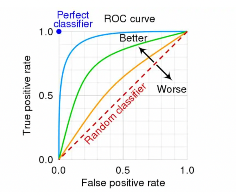
An ROC curve plots the True Positive Rate on the y-axis against the False Positive Rate on the x-axis, with each point representing a different classification threshold. The ideal classifier lives in the top-left corner (TPR=1, FPR=0), while random guessing produces a diagonal line from bottom-left to top-right. The further your curve bows toward that magical top-left corner, the better your model discriminates between classes.
The AUC summarizes this entire curve into a single number, the probability that the model ranks a randomly chosen positive example higher than a randomly chosen negative example. Values range from 0.5 (no discriminative ability) to 1.0 (perfect discrimination). But here's the catch: AUC treats all parts of the curve equally, obscuring crucial performance differences at specific operating points.
Consider two credit scoring models, both with AUC of 0.85. Model A might achieve stellar performance at low false positive rates (catching the riskiest borrowers with minimal false alarms), then plateau. Model B might rise more gradually, performing adequately across all thresholds but never excelling in that critical low-FPR region. Same AUC, vastly different business value, especially if you're a bank that cares most about identifying the top 5% riskiest applicants.
Reading the Curve's Shape to Pick Thresholds
The shape of an ROC curve tells a story about where your model shines and where it struggles. Learning to read these shapes transforms abstract curves into actionable insights.
A steep early rise followed by a plateau (the "front-loaded" or "elbow" shape) indicates a model that captures most true positives with minimal false positives, then hits diminishing returns. This sharp elbow represents an attractive operating region where you get maximum bang for your buck. Medical screening tests often aim for this shape, allowing high sensitivity without overwhelming healthcare systems with false alarms.
Gradual, back-loaded curves tell a different story. Here, meaningful gains in true positive rate only come at the cost of substantially higher false positive rates. These models lack that sweet spot where you can have your cake and eat it too. Each incremental improvement in catching positives requires accepting many more false alarms, a painful trade-off in domains where false positives are costly.
The degree to which a curve bows toward the top-left indicates overall discriminative power. A curve hugging the left and top edges suggests strong separation between class scores. Conversely, a curve lingering near the diagonal indicates heavily overlapping score distributions, your model struggles to distinguish between classes.
When curves cross, the choice becomes context-dependent. If Model A dominates at low FPR but Model B performs better at high FPR, your selection depends entirely on your operating requirements. A high-security facial recognition system might prefer Model A (fewer false alarms), while a preliminary medical screening might choose Model B (higher overall sensitivity).
Practical threshold selection often involves vertical or horizontal read-offs from the curve. Need 95% sensitivity for a cancer screening? Draw a horizontal line at TPR=0.95 and see what FPR you must accept. Can only tolerate 1% false alarms for fraud detection? Draw a vertical line at FPR=0.01 and check the achievable TPR.
Quantifying and Modeling Shape (Not Just AUC)
Recognizing that shape matters is step one; measuring it systematically is step two. Recent research, particularly by Błażej Kochański in credit scoring contexts, advocates reporting shape parameters alongside AUC/Gini coefficients. His work demonstrates that models with identical AUC can yield dramatically different economic outcomes depending on their ROC curve shape.
Researchers have developed various parametric ROC models to capture and quantify curve shapes:
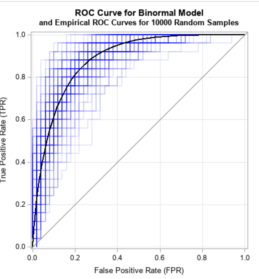
- Binormal curves assume Gaussian score distributions for each class, the workhorse of medical diagnostics
- Bigamma curves use gamma distributions, better capturing skewed score distributions
- Bibeta curves leverage beta distributions' flexibility for bounded scores
- Bilogistic curves employ logistic distributions
- Power curves offer simplicity but often fail to capture complex shapes
- Bifractal curves (Kochański's innovation) separate area and shape parameters explicitly
In empirical tests on credit scoring data, all models except the simple power curve provided good fits, with the binormal model emerging as a preferred choice due to its accuracy and convenient mathematical properties. By fitting these models, analysts can extract explicit shape parameters, quantifying whether a curve is front-loaded (steep initial rise) or back-loaded (gradual ascent).
This parametric approach enables powerful analyses. Banks can now select models not just by AUC but by alignment with risk appetite. A lender focused on minimizing defaults among approved loans might prefer a front-loaded curve that excels at low FPR, even if another model with the same AUC performs better at higher FPR ranges.
Partial AUC offers another way to focus on shape in specific regions. When only certain FPR ranges matter (say, FPR < 0.1 for high-stakes decisions), partial AUC directly measures performance where it counts, ignoring irrelevant portions of the curve.
Proper (Concave) ROC and Reliable Estimation
A theoretically sound ROC curve should be concave when viewed from below,the slope should never decrease as we move from high to low thresholds. Any "dip" or concave-down segment indicates a threshold range where you could achieve better performance by randomly mixing decisions, revealing an inefficient operating regime.
In practice, empirical ROC curves from finite samples often exhibit artifacts: S-shapes that cross the diagonal, hooks near extreme specificity, or jagged steps from limited data. These irregularities mislead threshold selection and violate the theoretical requirement that no intermediate threshold should be strictly dominated by a mixture of others.
Two main approaches address these issues:
1. ROC convex hull: Takes the upper convex envelope of empirical points, representing the best achievable performance through threshold randomization
- Placement value methods: Ghosal and Chen's (2024) Bayesian approach adjusts ROC estimation to enforce concavity, eliminating S-shapes and end hooks while preserving the curve's essential characteristics
Why does concavity matter beyond theoretical elegance? Non-concave ROCs suggest non-existent performance. That enticing dip might recommend an operating point that's actually dominated by neighboring thresholds. In medical decision-making, following such artifacts could lead to suboptimal diagnostic thresholds with real patient consequences.
Ghosal and Chen demonstrated their method on pancreatic cancer test data, producing cleaner ROC curves and more stable AUC estimates. The resulting proper curves better represent the true Pareto frontier of achievable performance, any point on the curve represents an optimal trade-off that cannot be improved without accepting higher costs elsewhere.
ROC Shape in LLM Development and Prompt Engineering
The principles of ROC curve shape analysis extend naturally to Large Language Model development and prompt engineering, where binary classification tasks are ubiquitous. From content moderation to intent classification, LLMs frequently serve as classifiers whose threshold-dependent behavior determines real-world outcomes.
Prompt engineering benefits enormously from ROC shape analysis. When crafting prompts for classification, the shape reveals where your prompt strategy excels or falters. A prompt that produces a steep early rise followed by a plateau suggests it effectively captures clear-cut cases but struggles with ambiguous examples. This insight guides prompt refinement, perhaps adding few-shot examples in the challenging region or adjusting the decision boundary language.
The multi-threshold nature of LLM outputs makes ROC shape particularly relevant. Unlike traditional ML models with explicit confidence scores, LLMs generate text that requires interpretation as classification confidence. Temperature settings, prompt phrasing, and output parsing all influence the effective threshold distribution. ROC curves expose how these choices affect performance across the decision spectrum.
Evaluation platforms like PromptLayer become invaluable for systematic ROC analysis of LLM prompts. By tracking prompt variations, their outputs, and ground truth labels, teams can generate ROC curves for each prompt strategy. This enables data-driven prompt optimization, moving beyond intuitive prompt tweaking to rigorous performance comparison. When Prompt A shows superior AUC but Prompt B dominates in the low-FPR region critical for your application, the choice becomes clear through shape-aware analysis.
Fine-tuning and RLHF (Reinforcement Learning from Human Feedback) also benefit from ROC shape considerations. Traditional approaches optimize for overall accuracy or AUC, but production systems often care more about specific operating regions. A customer service intent classifier might prioritize catching urgent requests (high sensitivity) over avoiding minor misclassifications. By incorporating shape-aware objectives during training, teams can produce models whose ROC curves align with operational priorities.
A/B testing of LLM-based classifiers should examine ROC shapes, not just aggregate metrics. Two prompt variants with similar AUC might serve different business needs based on their curves. Version A's front-loaded shape might reduce customer service escalations by catching urgent cases early, while Version B's gradual curve provides more consistent performance across all intent types. The ROC shape reveals which version aligns with your operational constraints and user experience goals.
Where Shape Matters Most
The practical importance of ROC curve shape varies dramatically across applications, with several domains standing out as particularly shape-sensitive.
Medicine and Radiology pioneered rigorous ROC analysis in the 1970s. Here, curve shape directly informs critical threshold decisions. A diagnostic test for aggressive cancer might require 99% sensitivity, the curve shape at high TPR determines whether this is achievable without overwhelming false positive rates. Radiologists comparing imaging modalities examine not just which has higher AUC, but which performs best in clinically relevant FPR ranges. The curve's shape near your operating point matters far more than its behavior elsewhere.
Machine Learning applications, especially with imbalanced data, benefit enormously from shape analysis. When positive examples are rare, even high-AUC models might show poor precision. The ROC curve's shape reveals where diminishing returns set in, that flat region where chasing higher sensitivity brings an avalanche of false positives. For fraud detection or anomaly detection systems, understanding this trade-off through curve shape prevents costly over-alerting.
Credit Scoring and Finance provide perhaps the clearest economic argument for shape awareness. Kochański's research proved that equal AUC doesn't mean equal profit. A front-loaded ROC curve (steep early rise) identifies the riskiest borrowers with minimal false rejections of good customers. This translates directly to reduced defaults and higher profits. Banks now increasingly request shape parameters alongside traditional Gini coefficients, recognizing that where the curve achieves its area matters as much as how much area it achieves.
Psychology and Recognition Memory research uses ROC shapes to test cognitive theories. When studying how people distinguish old from new stimuli, the shape of confidence-based ROC curves (especially when plotted on z-score axes) reveals whether recognition involves single or dual cognitive processes. Changes in curve shape under different experimental conditions provide evidence for competing theoretical models of memory, demonstrating that ROC shape analysis extends beyond purely practical applications to fundamental scientific inquiry.
Limits of ROC/AUC and Effective Complements
Despite their utility, ROC curves have important limitations that shape-aware analysis alone cannot overcome.
Class imbalance represents the most significant challenge. With extreme imbalance (say, 1% positive class), a model can achieve impressive AUC while maintaining terrible precision. The ROC curve looks good because the false positive rate's large denominator (many negatives) masks numerous false alarms. Here, Precision-Recall curves provide essential complementary information, directly showing the trade-off between finding positives and avoiding false discoveries.
ROC analysis is inherently cost-insensitive. The curve treats all errors equally, but reality rarely does. Missing a cancer diagnosis carries different consequences than a false positive. While ROC curves show achievable trade-offs, they don't indicate optimal operating points without domain-specific cost information. Overlaying iso-cost lines on ROC plots helps bridge this gap, showing which thresholds minimize expected cost given your specific error penalties.
Uncertainty in ROC curves often goes unreported. Small samples produce wiggly curves with crossing confidence bands. Focusing on point estimates of AUC or curve shape without considering statistical uncertainty leads to overconfident decisions. Proper analysis requires confidence intervals, statistical tests for curve comparisons, and recognition that sample noise affects different curve regions differently; extremes typically show more variability than central portions.
The Shape of Better Decisions
The ROC curve tells us far more than its area suggests. Shape exposes where a model wins or falters, information that AUC averages away. Equal AUC can hide crucial differences in real-world performance, especially when specific operating regions matter more than others. Ensuring curve concavity prevents chasing illusory performance from statistical artifacts.
The path forward is clear: inspect and report shape, not just AUC. Use parametric fits or explicit shape indices to quantify curve geometry. Enforce concavity to ensure you're viewing genuine performance trade-offs. Complement ROC analysis with Precision-Recall curves for imbalanced data and domain-specific cost considerations for practical deployment.
The shape of the ROC curve conveys critical, threshold-specific behavior that drives real outcomes in medicine, finance, and machine learning. By embracing shape-aware analysis, measuring it, comparing it, and ensuring its theoretical soundness, we make better, more context-appropriate decisions. In the end, it's not just about how much area lies under the curve, but where and how that area is achieved.
PromptLayer is an end-to-end prompt engineering workbench for versioning, logging, and evals. Engineers and subject-matter-experts team up on the platform to build and scale production ready AI agents.
Made in NYC 🗽
Sign up for free at www.promptlayer.com 🍰